Client: The Australian Ballet
Project: Cinderella Brochure
For this project the client wanted a beautiful and clean design to encapsulate the simplicity and beauty that is the artform of storytelling through ballet. The client also had very specific needs and requirements for print and only the budget for two spot colours.
The challenge for this project was how to create variety, contrast and beauty with such restrictions. "Learn the rules like a pro, so you can break them like an artist." - Pablo Picasso.
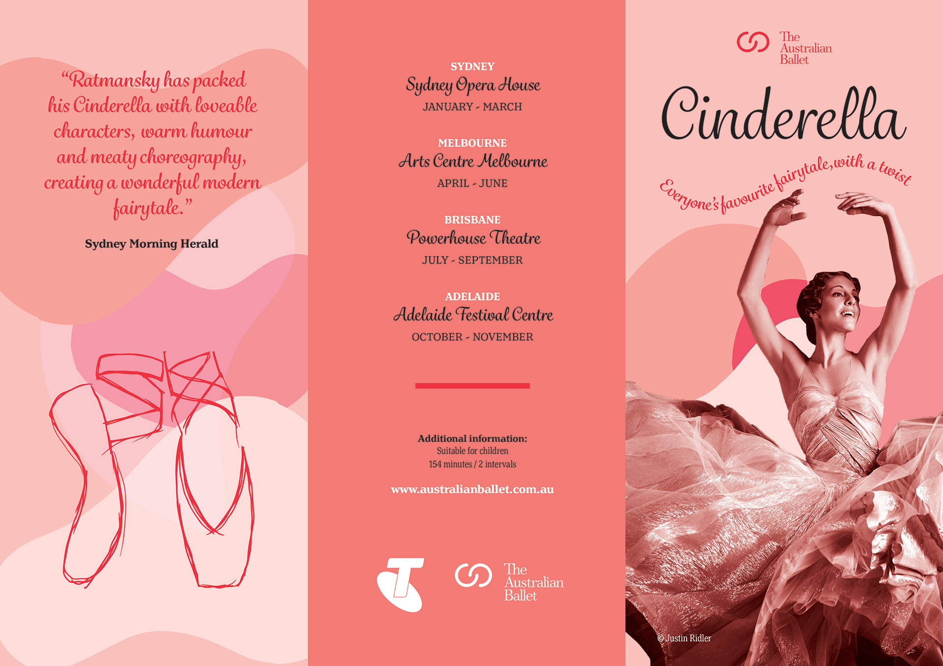
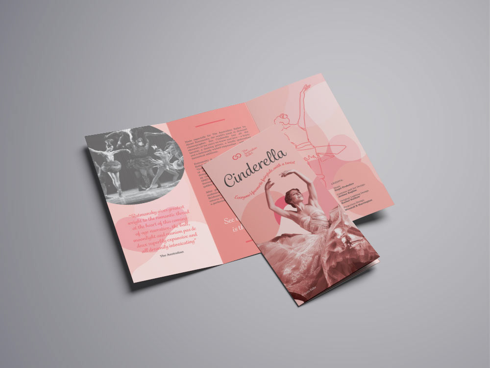
Front page of the design: Featuring the front cover, back cover and inner panel.
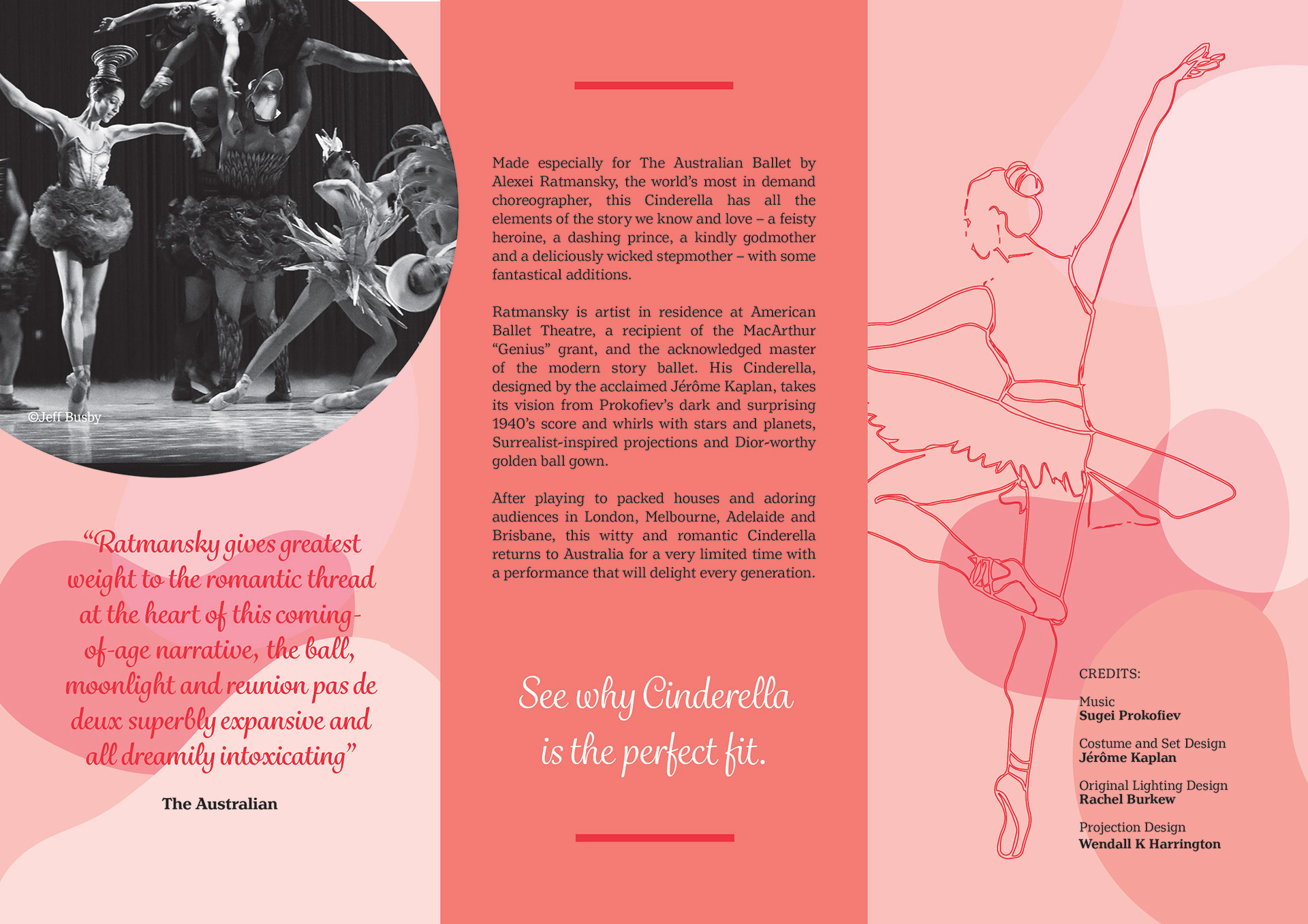
Inside pages of the design.
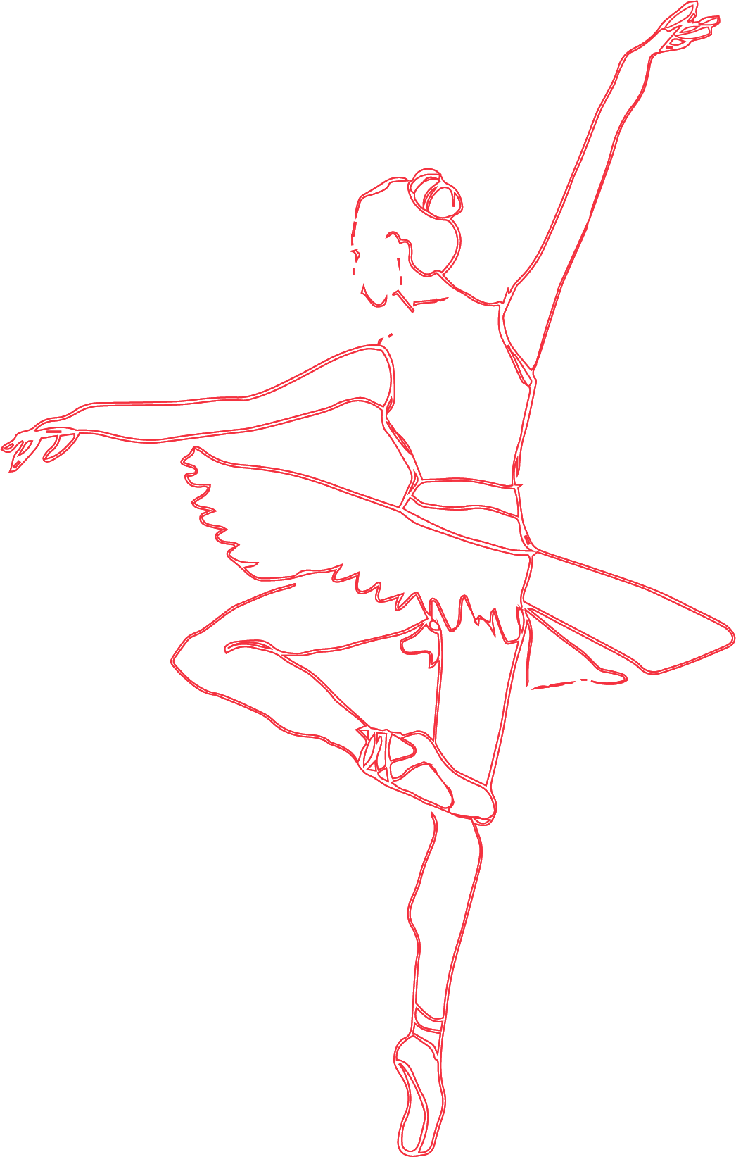
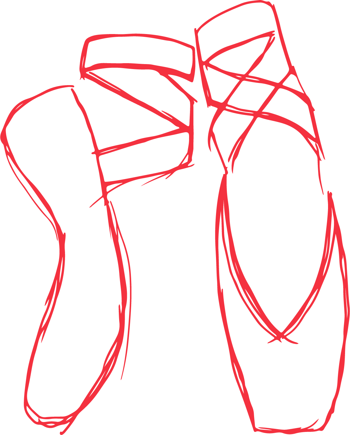
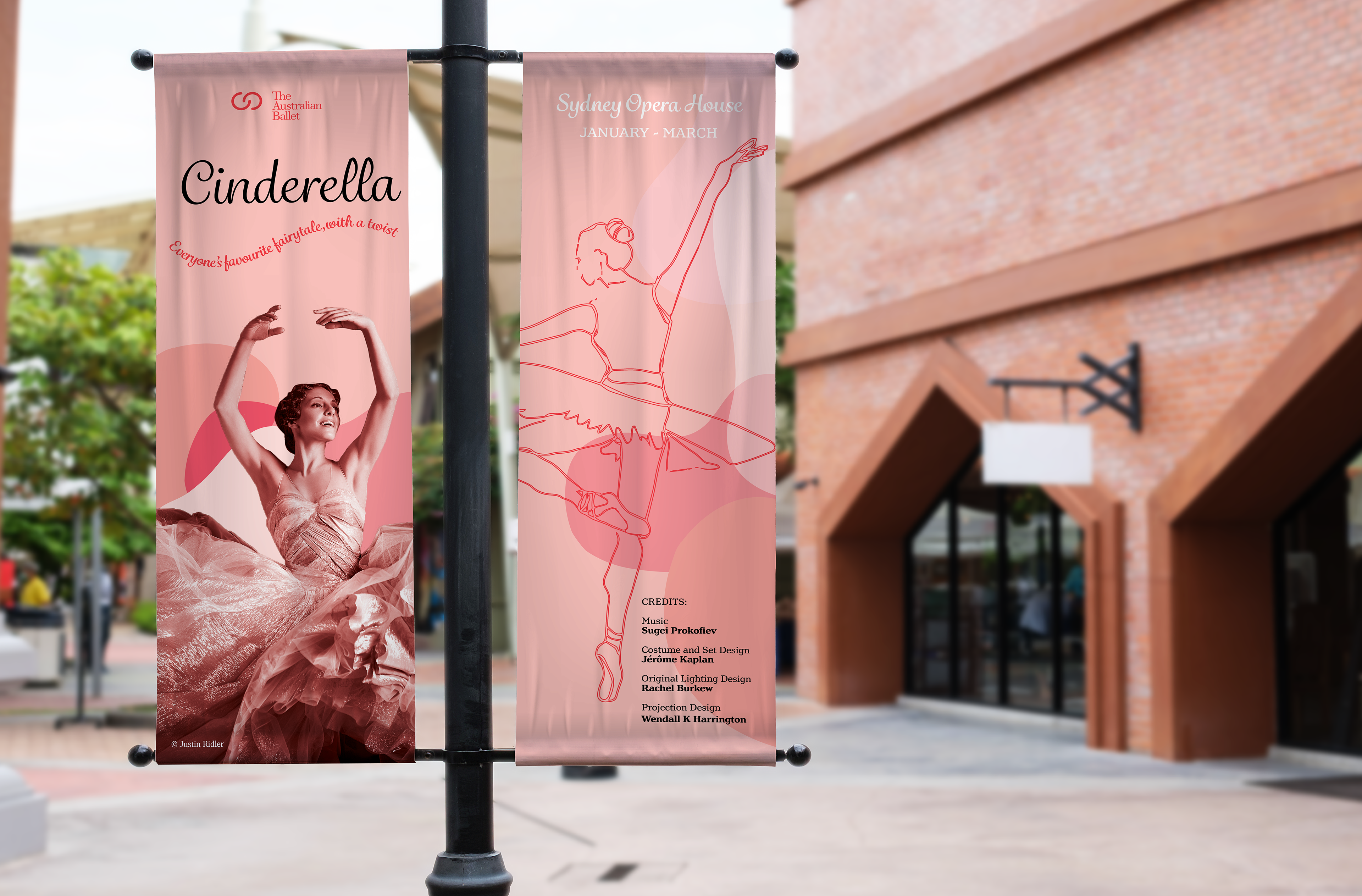
The colours I chose were Black and Pantone Red 032. The rules I broke was using effects and overlapping of different tints, and the absence of ink (paper) to create more colours to see visually. I was given a set number of images from the client to use in the brochure design. I only liked two of them and no other sources provided images that fit the overall feel of this design so I illustrated my own. I made them hero pieces in the design to embody the beauty in the ballet dancers form, to really create the harmony of the beautiful and simplicity that the client was after.